
Kapihan Coffee Roasters
BRAND IDENTITY & CUSTOM TYPE DESIGN
Kapihan is a proudly Filipino coffee shop in the UK. It’s a family-run business founded by siblings who grew up on stories of their grandfather’s morning ritual: a bite of pandesal dunked in kapeng barako. By combining traditional Filipino flavours with modern coffee and pastry-making techniques, Kapihan playfully positions itself as D’ Original House of Kape’t Tinapay in their little corner in Battersea, London. I had the opportunity to work on their brand identity during my stay at Plus63 Design Co.

Like its approach to coffee and pastries, Kapihan’s identity is a meeting of old and new. The brand logo, for instance, is a digital interpretation of the natural geometric forms in traditional woven works. The result is a modern identity connected to a deeply Filipino aesthetic.


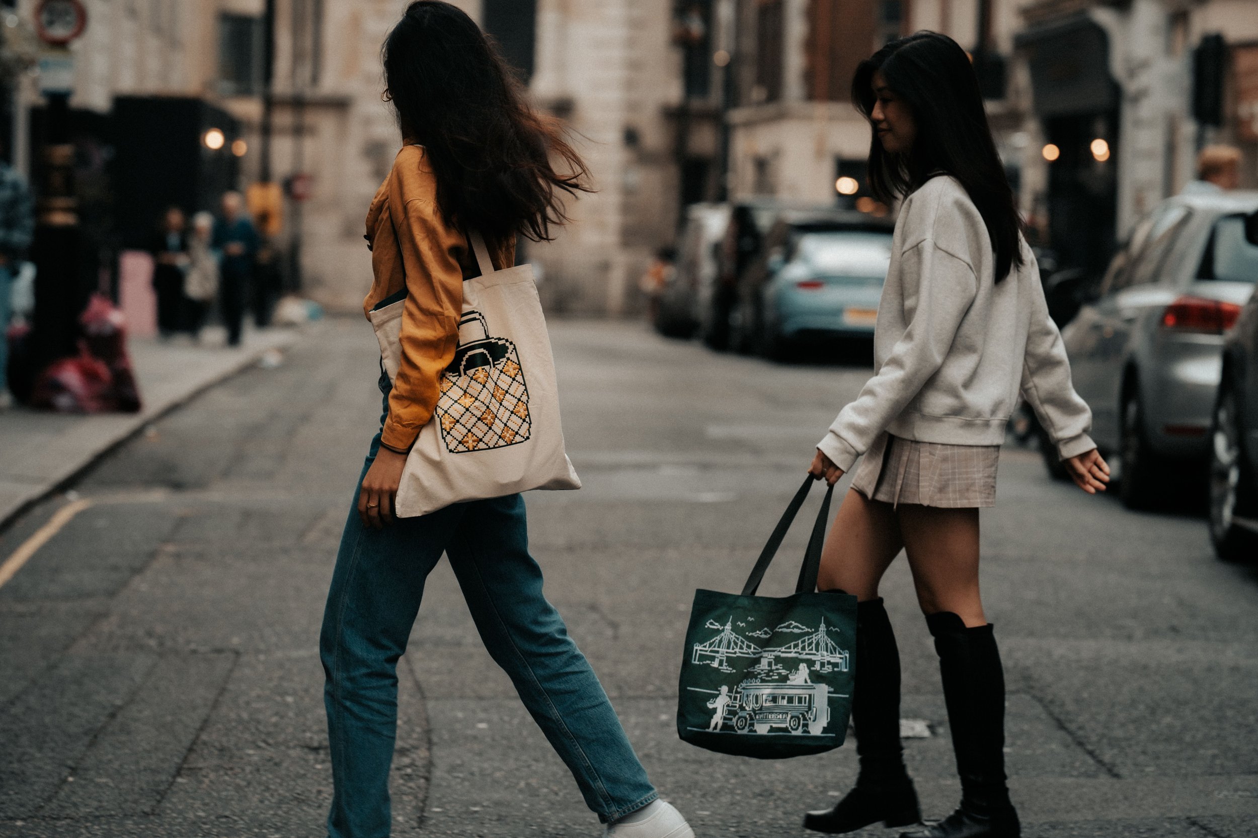
Kapihan’s identity extends to images of Filipino culture and history—occasionally mixed with scenes of life in Battersea, London. These digitally-drawn illustrations and accents appear all over the brand’s assets, such as in cup sleeves, coffee pouches, and the shop’s signage.
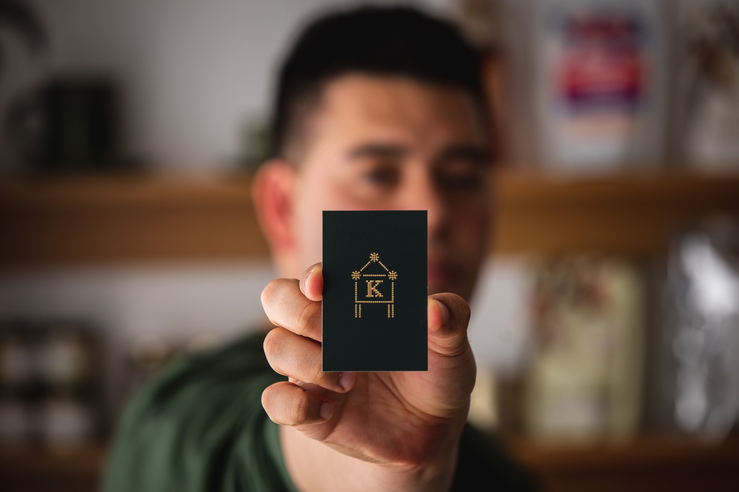


I created the logotype and design of most of the brand identity materials, but I focused most of my type in creating Kapihan’s custom typeface called Kwadra Display, a name borrowed from the Filipino word kwadrado, or square.


It builds upon the identity’s adaptation of traditional woven designs using letterforms characterised by occasional notches. Kwadra is chiefly used in the wordmark but also appears consistently in the brand’s packaging design.


Brand Identity by Plus63 Design Co.
Creative Director: Dan Matutina
Graphic Designer: Jo Malinis
Illustrators: Craig Halili and Anton Romero

Photos by Matt Hickman
Copy by Miguel De Dios
Animation by Janina Malinis