
Maroons
CUSTOM TYPEFACE
Maroons is the official type family of the U.P. Fighting Maroons, the collegiate varsity program of the University of the Philippines. As part of the brand identity that we also developed for it, my co-designers at Plus63 Design Co. and I revisited the original version of the typeface that we created in 2015 to finetune its sharp, unyielding forms and expand the font family for more diverse applications.

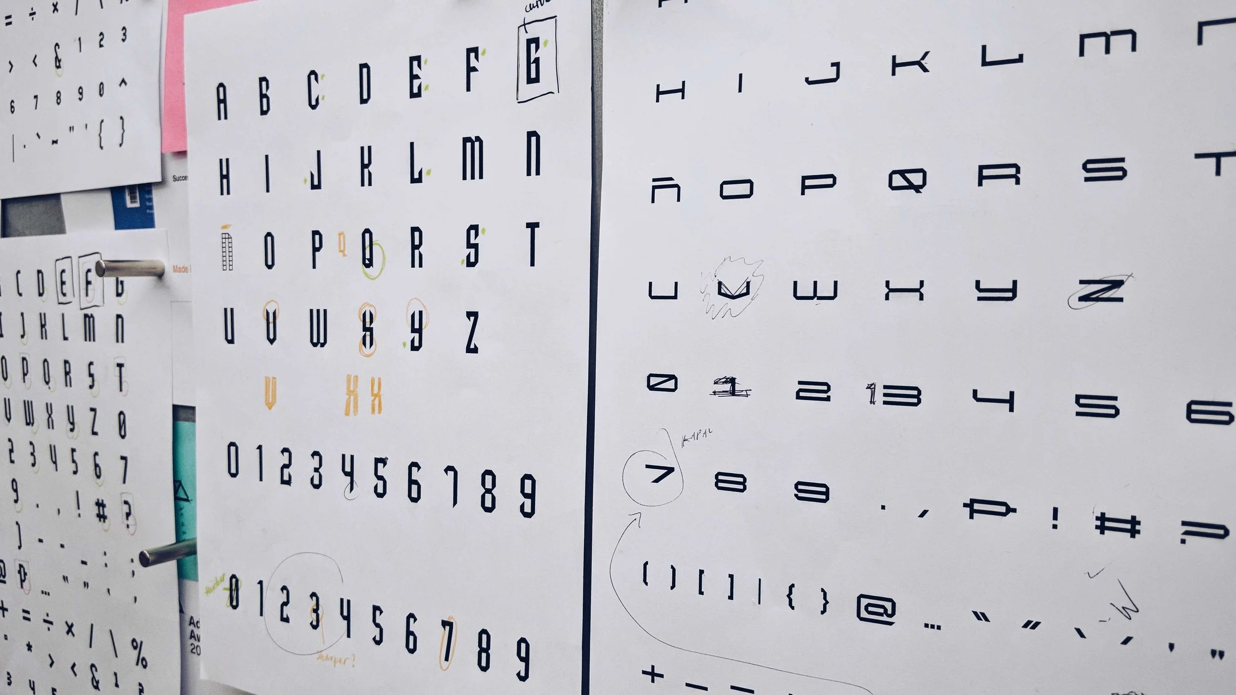
This project was my first experience in developing full glyph sets for a family of three typefaces. As the only designer in the studio who works with type, I was tasked to lead the project from the creation of the typefaces all the way to the art direction and design of the U.P. Fighting Maroons brand.

Aggressive and athletic, Maroons is inspired by constructivist and activist aesthetics rooted in the university’s proud history of igniting socio-political action. Its forms are angular, sharp, and unyielding— a bold distinction from the typical serif and blackletter typefaces used by rival academic institutions in the Philippines.
My team and I made sure to preserve these qualities across all typefaces.

I started by revising the typeface that we created back in 2015, Maroons Sharp, which was based on the logotype made by AJ Dimarucot. I then proceeded to draw a less narrow version, Maroons Strong, and a wider version, Maroons Wide.


The hero type, Maroons Sharp’s cutting and unforgiving form is denoted by spearpoints cut in perfect, 45-degree diagonals.

Maroons Sharp Regular

Maroons Sharp Bold

Maroons Strong introduces heft and stability to the type family. Its primary use is in the UP Fighting Maroons logo. As a font reliable for its legibility, it can convey bigger and longer messages than the narrower Maroons Sharp, therefore making it a suitable font of choice for banners, posters, and ads.

Maroons Strong Regular

Maroons Strong Bold
The tertiary typeface in the family is Maroons Wide. Stout but lean, it emerged from a need to brand uniforms that couldn’t accommodate longer lockups. It was first seen in the women’s volleyball team as the “UP” mark emblazoned on their bikini tops and then later used in the home jerseys for the men’s basketball team. Outside official apparel, Maroons Wide works best with short headlines and large-scale applications.


Maroons Wide
